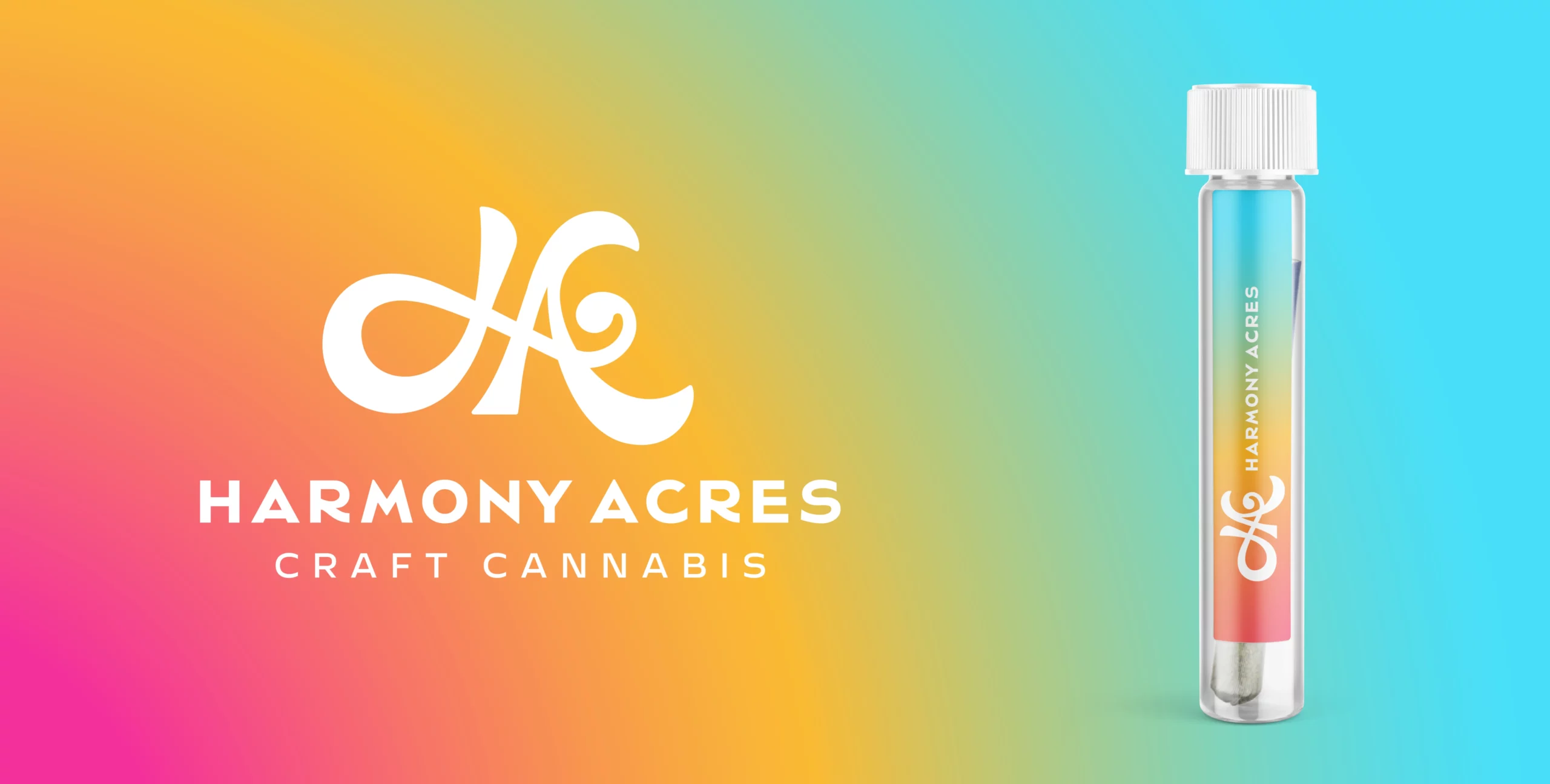
We had the exciting opportunity to work with Harmony Acres, a cannabis brand that wants to be known as the "Starbucks of Cannabis." Our task was to create a unique brand that spoke to the dependability and consistency of their products.
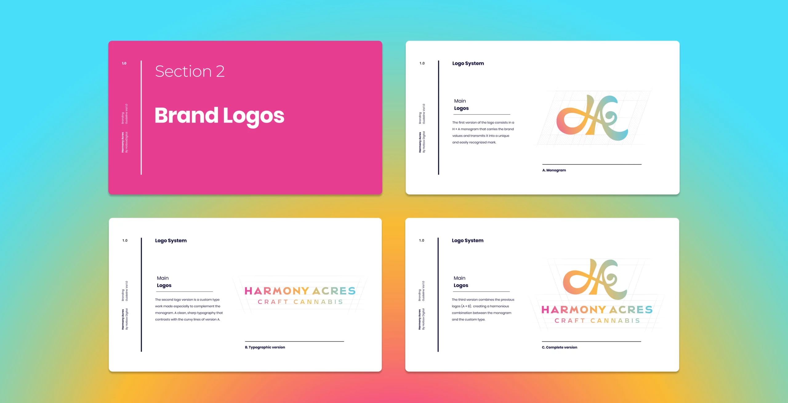
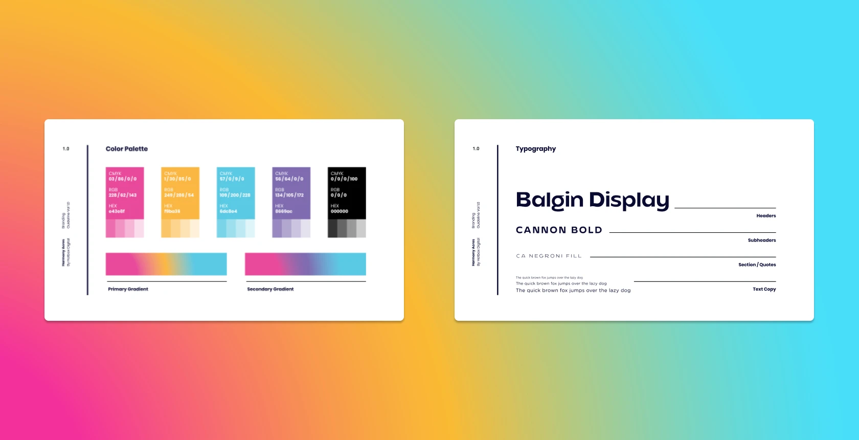
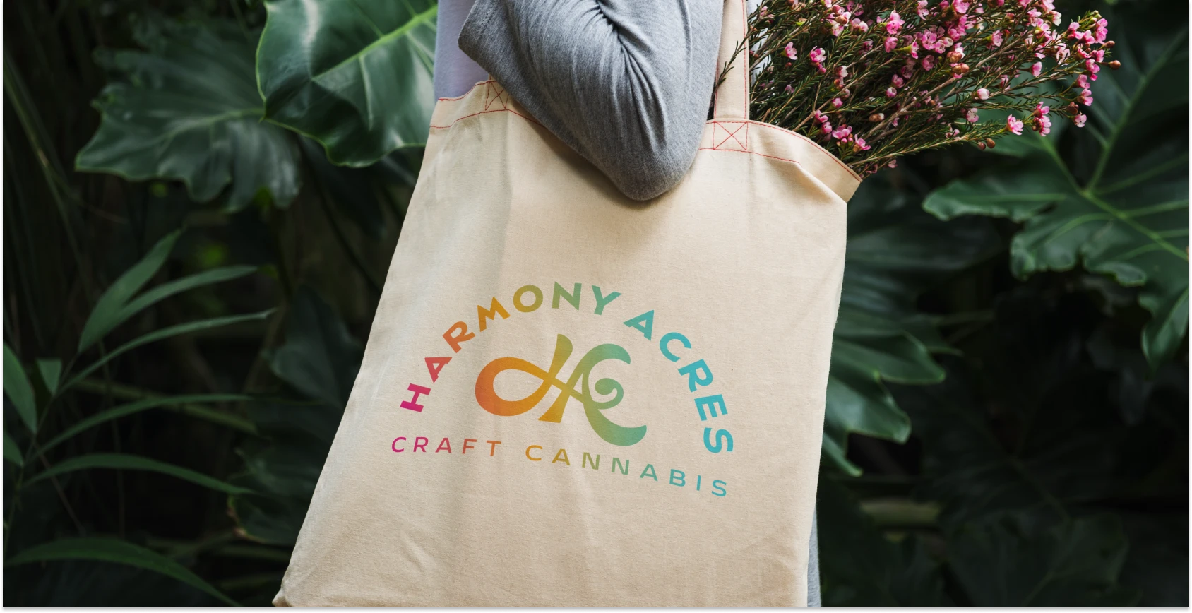
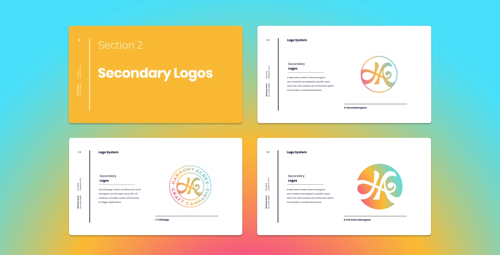
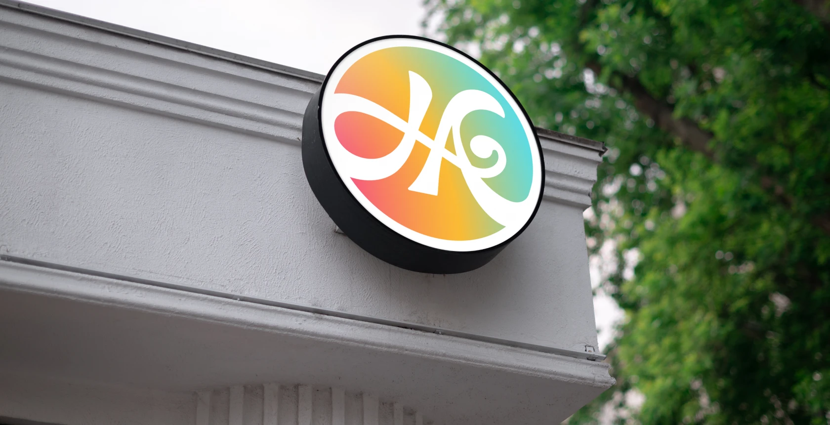
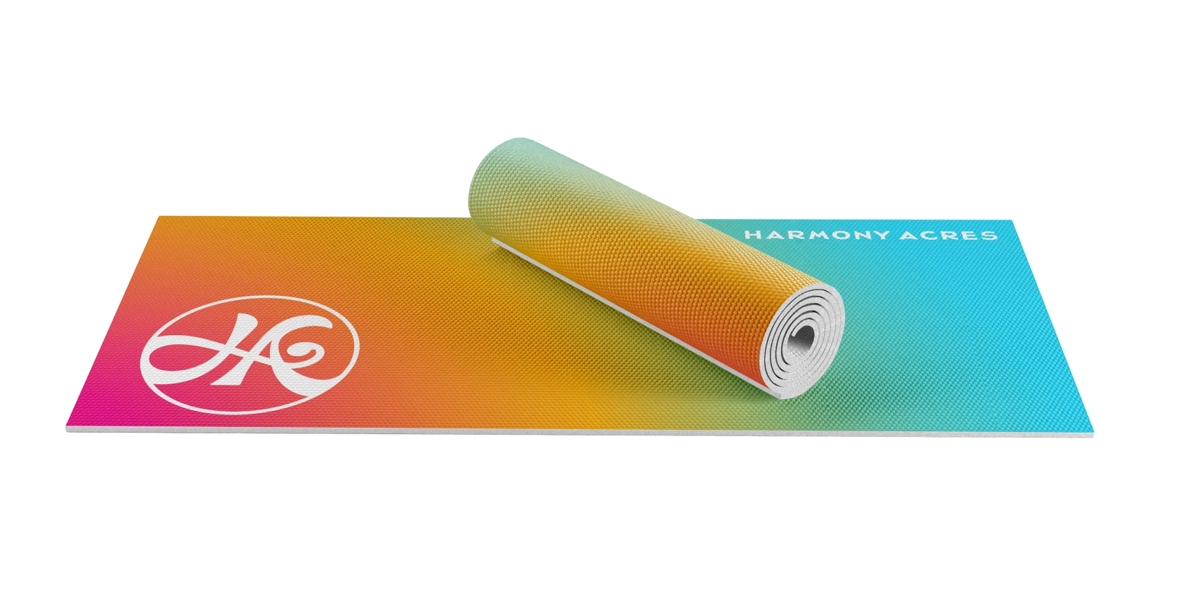
After diving deep into research and collaborating closely with the Harmony Acres team, we came up with a brand strategy, visual identity, and logo that perfectly captures their vision. The logo is a modern expression of a bass clef combined with the initials H.A. We combined the harmonics of music with a rainbow color palette to inspire feelings of elation and happiness. Combined with a brand strategy built for its target audience, Harmony Acres is ready to succeed in the Oklahoma market and expand far beyond.